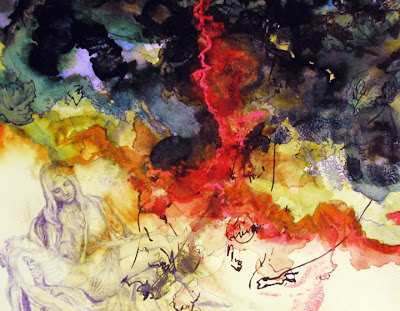
 |
| Oil, acrylic, watercolor paint on paper. |
About to unwrap my beautiful new Mac, and install Photoshop CS6, I find myself wondering when I will be painting with the messy stuff again (oil, acrylic, watercolor). We're moving to a new place this week and I am pointedly NOT moving my painting studio in with me. Nope, saving the little work nook all for the Mac, etc! The idea is that I would rather rent a small painting studio somewhere else soon, but I'm a realist; how soon is soon? Easels, drawing table, paints, canvases, and all, are for the moment going...into storage.
Actually, I have been slogging along with the many, many paintings required for the illustrations of a new book (the above is just one), and I am seriously considering finishing them digitally. I had always meant to edit them in Photoshop, to get them ready for inclusion into the book, but maybe I will do a little more than just editing. Is that a cheat or the easy way out? Why does it matter?
 |
| Acrylic, watercolor paint on paper. |
In many ways, painting more of these illustrations digitally would be easier, and more fun. For example, the playground above is a full two-page panoramic, with about a million leaves, pieces of mulch, a complicated architectural structure, and a dozen people. It makes sense to finish this one digitally, zoom in close to paint details, measure structural supports with guides, and copy and paste repeatable elements like leaves. Why not?
On the other hand, all of the best nuances of my favorite work, like the one used as a background for this blog, come from experimenting with whatever I have at hand: pencils, pastels, gouache, ink, gold leaf, throw it all in! Never underestimate the power of a serendipitous ink spill or an idiosyncratic doodle.
 |
| The image used for the background of this blog, a painting from 2007. Watercolor, acrylic, gouache, pastels, graphite, ink, charcoal on paper. |
 |
| Another painting from the same series. Similar materials as above. |
This is my favorite way of working! Here are some new paintings from a series, "40 Paintings" about which I'm currently writing an instructional painting book (boy is that a lengthy project, don't look for it for years, whew!):
 |
| Watercolor, ink, gold leaf on paper. |
 |
| Watercolor, acrylic, ink, pencil on paper. |
But then, think of all the happy accidents that I might harness while learning all the cool new tricks in CS6! My guess is that I'll use plenty of both "real" paint and digital paint like in this earlier example of my learning to paint in Photoshop a couple years ago. Here's a link to the tutorial.
 |
| Digitally created image. |
I had a hard time titling this blog entry, in fact, because I believe that painting is throwing in any and all materials at hand to make the image closest to what I imagine in my mind. Why should digital tools not be included in that? Somehow, I think a couple of my Parson's professors might argue against that idea. Then again, more would argue for it.


