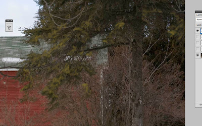
I'll use a drab photo to start with, and instead of a sad, grey little tree, you will have this beautiful, colorfully painted tree:
I'll use the right-hand tree in the following image as a starting point.
1. First, create a new layer and name it "base mix." Select the Mixer Brush (underneath the Paintbrush) and use the options "Clean Brush After Every Stroke," and "Very Wet, Heavy Mix," and make sure the "Sample From All Layers" check box is checked. Use a small round brush, with a medium hardness. I used a 4 px brush with 45% hardness. On the "base mix" layer begin mixing the colors of the tree trunk, branches and leaves with short, random strokes that mimic the texture of the tree itself. The point of this layer is to give you a good, painted-looking base with the original tree colors, so that your photo will not show through. You are also able to fill out the tree, giving better volume, and minimizing those spindly, dead branches, and bare unattractive areas.
HINT: You can turn the visibility of your Background layer on and off, to check coverage and see the texture of your strokes.
You should end up with something like this:
2. Now, one of the first things you may notice in this last image is the dreariness of the colors that have been mixed from the photograph. One would probably paint a tree with much more vibrancy, and that's is the way you should think about painting digitally, too. The first thing we will work on is the shadows, so make a new layer above the "base mix," layer, call it "shadows," and turn off the visibility for "base mix." When painting in real life, one has the option to add all kinds of beautiful cool shades to the shadows, instead of just using a dull grey or black. When I paint shadows, I often add translucent glazes of violets, greens and blues to give the shadows more depth and activity. Let's start with the tree trunk and add some nice eggplant violets to the deepest shadows. I used a #25 Round Blunt brush, Bristles: 16%, Length: 137%, Thickness: 1%, and Stiffness: 56%. My angle is determined by my Wacom Intuos4 tablet. Double-click the Foreground color in the tool bar to select a dark purple with the Color Picker. Change the Mixer Brush options to "Load The Brush After Every Stroke," and "Dry, Light Load." Varying brush size and zooming in close, paint the darkest shadows with the purple.
In the same manner, use a midnight blue to paint the darkest parts of the limbs and leaves. Notice that I am painting over the white, spindly branches, as I want to get rid of them, and I am using brushstrokes akin to the shapes of the leaves and branches.
Change the Opacity of the "shadows" layer to 40%, and you should have something like this:
3. Now, for the midtones. The color for the midtones should be derived from the actual colors of the photo, so that the painting will look more natural. Bring up the Color Picker again and use the eye dropper to sample a greenish color from the leaves. Whoa! What an ugly brownish-grey that is, once you see it in the Color Picker! Move the slider to the green hues and you will get a more vibrant green, while keeping within the realm of the "greens" in the photo.
Create a new layer in the top of the list, call it "midtones," and turn off visibility of all but this new layer and the Background layer. Keep the same Mixer Brush options and use a feathery, leaf-like brush (I used the #32 Flat Angle brush, Bristles: 6%, Length: 127%, Thickness: 23%, and Stiffness: 45%, and I varied the size and angle for randomness), and paint in the midtones of the leaves.
Don't worry about full coverage, because you will use 2 shades of green. After going over the entire leafy part of the tree once, open the Color Picker again and move the little circle up and to the right a bit to get a slightly more yellow, lighter green. Repeat coverage of the midtone leaves, lending more depth and variety.
For the midtones of the tree trunk, use the same method with Color Picker to select a base brown from the photo, and use the slider or the circle to select a warmer, more interesting brown. Paint the midtones of the trunk with this color with the same brush.Turn the visibility for all layer on, reduce the "midtones" layer to 60%, and you should have something like this:
4. Same drill for the highlights! Select the lightest leaves and change to a more vibrant version, lighter with more yellow, in the Color Picker. Create a new layer, call it "highlights," and turn off visibility for all layers except this new layer and the Background layer. The highlights will need far less coverage than the midtones, and should just be dabs of bright color, like dappled sunlight. So, keeping the same Mixer Brush options, use an appropriate brush for dappling (I used the #25 Round Fan brush, Bristles: 66%, Length: 25%, Thickness: 1%, and Stiffness: 88%, at a very small size), and paint in the lightest highlights. I used quick, dabbing strokes, picking my brush completely up off the tablet between each stroke.
For the bark, you guessed it! Select the lightest color from the trunk with the eye dropper in the Color Picker and move it to a lighter, warmer color. Paint the lightest parts of the trunk in the same manner as the above highlights.
Turn visibility on for all layers, decrease the "highlights" layer to 80%, and...
...you're done!


